What are the benefits of a banking dashboard for your operational business intelligence?
You can scour the Internet for reasons why to implement a banking dashboard and examples of how to do so. But in this article, we’re going to take a good close look at what banking business intelligence dashboards can do for your operations.
Benefits of properly implemented banking dashboards include:
- Transforming unused banking data assets into insights that drive results.
- Live reporting instead of waiting for monthly roll-ups from manual analysis.
- Increased accuracy of reporting.
- Improved operational efficiency from increased process visibility.
- Forced data standardization and improved data quality.
- Improved insight into risk management – be sure to check out 35 banking Key Risk Indicators here
Up next, we’ll highlight the top three uses and dashboard categories for retail banks. And we’ll drill down into the details you can use for your own banking dashboard.
But first, what is a banking dashboard?
A banking business intelligence dashboard is an analytical display tool that’s linked to different banking data sets across multiple systems. Those systems include but are not limited to: the bank’s core banking platform, CRMs, loan-processing software, and any other type of banking data warehouse.
Banking dashboards are used to visually track and display banking KPIs (those are key performance indicators; more on them in a minute). They also track banking business process results, customer trends, financial performance… pretty much anything you want to track, so long as you’ve got the data to crunch. Banking executive dashboards help you look back, to see historical trends in, say, consumer or commercial lending. They can also, to an extent, let you peer into the future, via predictive analytics.
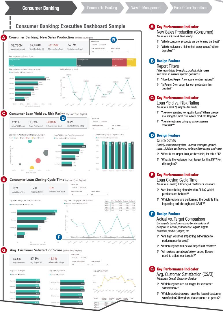
A “scrubbed” executive level banking dashboard recently implemented at an Opsdog customer using Power BI can be seen below.
How do you create a banking dashboard?
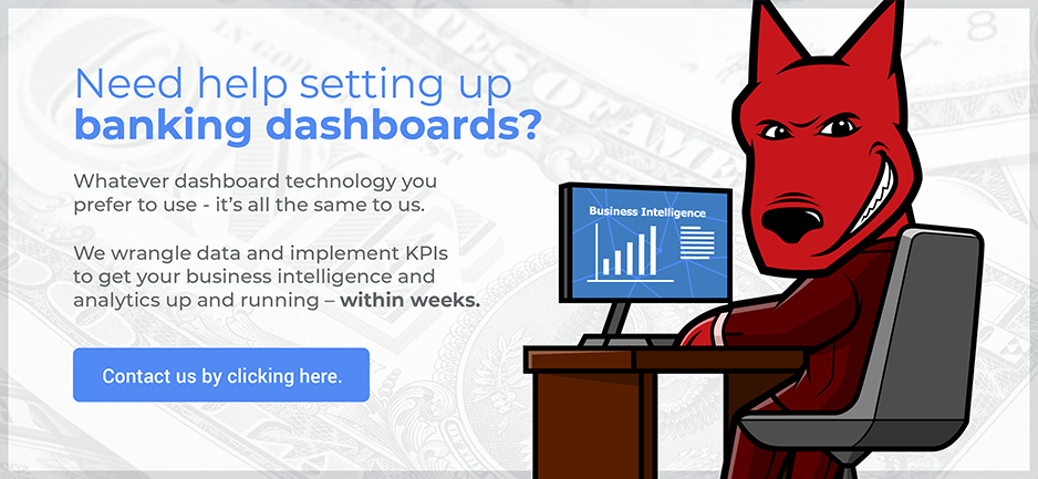
Banking dashboards don’t just create themselves. The bulk of the work done to create reliable and accurate dashboards lies in two areas: 1) KPI selection and 2) data preparation. Believe it or not, the technology you use to display them really doesn’t matter. Power BI, Tableau, Qlik… they are all the same at the end of the day. It’s the underlying data structure and KPIs that matter most.
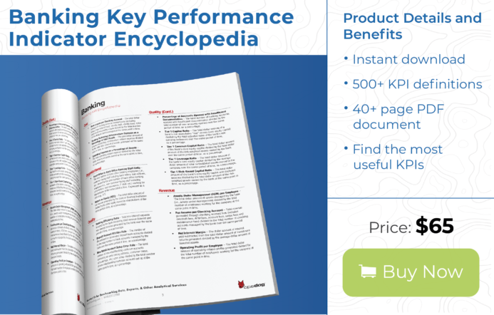
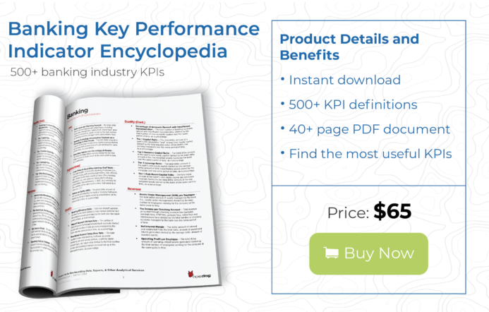
The first step to any dashboard project is nailing down what you need to measure from a KPI standpoint. If you go into a banking dashboard project thinking that the KPIs you need to measure will just magically appear out of the air, you will be bound to fail. You can start to generate ideas for what KPIs you need to measure by reviewing this Banking KPI Encyclopedia here.
Step 2 involves internally sourcing the data that you think you need to create the banking dashboards. But you can’t just stop at plugging into a data source and expecting the dashboards to come out clean. You’ll have to manually analyze all of the data sets first to see if you can even create the KPIs you selected to measure. Eighty percent of the time, you’ll have to manually tag the data with additional metadata to make it even remotely measurable. Yes, data wrangling is a beast of a task—and the bulk of the work for any banking dashboard project. But once you have the data clean, then you can plug into your business intelligence dashboard software of choice.
Here’s a banking dashboard lifecycle infographic of a typical implementation project:

Before a dashboard design is finalized, we wrangle the necessary data out of your data warehouse systems.
What are the top examples of banking dashboards?
We mentioned that banking dashboards can show you nicely-crunched operational data. But they must reflect actual strategic or operational goals to provide actionable insights—and be valuable. Sure, you can use a business intelligence dashboard to measure how many pencils you have in the supply room of your bank over time. But that wouldn’t be a terribly intelligent application of the technology. Banking dashboards must always be strategic, operational, and analytical in nature.
As promised, here are the top three categories for banking dashboards:
- Banking financial performance dashboards. These provide an instant, up-to-the minute snapshot of the bank’s entire financial position and finance-related KPIs. Think of this as the bank’s financial statements, displayed visually using business intelligence. Risk-management KPIs are typically rolled up into these dashboards to measure the amount of leverage and associated risk of a bank’s portfolio at any moment in time. Interest-rate risks, credit risks, loan losses, and profits are also captured in these types of banking dashboards.
- Banking operational reporting dashboards. These are KPI-driven “report cards,” showing how efficiently and effectively (or not!) your bank’s business operations are running. Operational dashboards focus on productivity, service levels, headcount ratios, and overall metrics that focus on volumes of work being processed against the cost of the production. Not only can you use these to measure the overall performance of entire business units, you can even configure these to drill down to measure individual employees at the front-line level.
- Banking customer experience dashboards. Don’t you always want to know the way your bank is performing… from the customer’s point of view? These types of banking dashboards give you that insight. By linking disparate data sets from your bank’s CRM (customer-relationship management) and customer-survey systems, you can generate daily visualizations, revealing trends of how your business is performing against customer expectations. Newer technologies even let you capture social-media trends about your business if you plug them into external web-facing platforms.
Operational business intelligence: Banking dashboard design and KPIs in action
Not all KPIs are created equal. Some are more closely tied to executive goals than others. For example, some might show trends in compensation. If you’re a publicly-traded company, then you can be sure that this data will shown to shareholders and board members alike.
But rather than dwell in the hypothetical, let’s look at some actual banking business intelligence dashboards. These are based on real projects which we’ve done at OpsDog for our banking clients; we’ve scrubbed them of any identifying details for this blog. Of course, if you’d like us to create custom dashboards for you, just ask.
The following dashboards were designed by OpsDog, using our own cloud-hosted business intelligence platform with Microsoft Power BI. Remember, the technology in which these can be displayed really doesn’t matter; we just like Power BI because it’s a lot simpler than the others.
A. Banking dashboard example KPI: Total loans & deposits. This one is pretty straightforward. The name says it all. Need a “gauge” on your business intelligence dashboard that shows your bank’s status at a glance? This might be it.
Look at the bar graphs in this dashboard. See how quickly they can answer common questions. Are deposits growing? In which regions? How fast? Why are they growing in one region but not another? What about loans?
When used in a banking dashboard, this KPI helps gauge the effectiveness of your business’s individual branches. If you track this metric on an ongoing basis visually, your banking business intelligence dashboard will help you review loan and deposit trends over time. It will help you measure loan growth progress against goals. It will accurately benchmark your deposits per branch employee—or commercial loans generated per loan officer per week. At the same time, it will help you set performance targets, identify areas for process improvement, and even identify possible places to plug in automation.

Note the time increments for growth rate data. We like to give your banking executive dashboard little touches like that.
B: Banking dashboard example KPI: Net charge-off rate. In banking, some debt will not be recovered. Specifically, the ratio of recovered delinquent debt to gross charge-offs is known as the “net charge-off rate.” It’s an important KPI to have in your banking dashboards—something that must be adequately explained to shareholders and executives.
Why include this metric? In some ways, it can provide its own answers. Here’s an example: Say the data is pointing to one specific (and disappointing) product. You can dive then into that product’s details and see if there’s anything you can alter to prevent that product from driving the rate higher. It’s a classic case of a banking business intelligence dashboard paying for itself.

You can also drill down to specific regions with this KPI, increasing the ways this section of your banking dashboard helps you.
C. Banking dashboard example KPI: Average customer satisfaction score. This metric, not surprisingly, holds great value for a banking executive dashboard. It’s not just about faceless numbers. Companies can live and die by customer satisfaction. And “customer satisfaction” doesn’t just mean how happy customers are, although it plays a large part, of course. It means getting to know your customers on a deeper level and using that data to engage your employees with them. It means understanding customer feedback, improving based on that feedback, and bringing a human face to those interactions.
Like any other business dashboard metric, customer service has trends that come and go (just look at the fluctuations on the right side of the dashboard illustrated above). A banking business intelligence dashboard can help you identify those trends in a timely and accurate fashion. This puts power in your hands.
Identifying trends lets you get ahead of the game. You’ll get insights that drive richer customer interactions, which will help develop further analysis. With business intelligence, you’ll start to realize why customers are happy or unhappy with your service. You’ll be able to group customers by demographics, industry sentiment, and feedback topics. Most importantly, you’ll be able to identify with great accuracy, and in real time, where you’re doing well and where you need to improve.
OpsDog dashboards are designed to be powerful and user-friendly. For “customer satisfaction,” you can easily visualize the performance of different aspects of customer service. You can pinpoint specific regions. You can drill down to individual products. Everything you need to see the way customers feel about your company is in your hands. The result? You can make decisions faster based on solid data for normally qualitative ideas.

Notice in these banking dashboard examples that we make sure to include 12-month trend graphs for each banking KPI.
D. Banking dashboard example KPI: Efficiency ratio. One vital way to measure a bank’s health is to show how well it utilizes its assets and liabilities. That’s exactly what the “efficiency ratio” measures in banking analytics.
To calculate your bank’s efficiency ratio, divide its operating expenses by its revenue. This is a great way to track the performance of commercial and investment banks. If the efficiency ratio starts to climb upward, this means that either your expenses are increasing or your revenue is decreasing—time to take action. The reverse, of course, is true if your efficiency ratio decreases—time to pat yourself on the back. Curious about what to shoot for? Fifty percent is widely considered to be an optimal efficiency ratio.
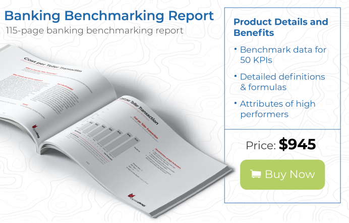
By this point, it should be pretty obvious why we include the efficiency ratio in a banking executive dashboard. It’s a great surface-level way of measuring success. You can look quickly at the data and figure out which products are most efficient, or which regions are most profitable. Combine that with benchmarking data (view or download some of our great benchmarking products here) to get a pulse on the competition, and how your bank stacks up.

It’s all about the bottom line when it comes to this section of our banking dashboard examples.
The OpsDog approach to banking dashboard design: Nesting BI reports by management level in your organization
These banking dashboards aren’t just beautiful. They’re efficient and accurate, too. That can be traced to their foundation of appropriate KPIs, drawn from our extensive database and independently researched by our team.
Every dashboard we design comes complete with special OpsDog touches to maximize its value to your bank. You’ll get Report Filters that drill down to specific regions, products, date ranges, and operational levels in your bank. This hierarchy is baked in, making it easier for you to follow and drill down to find insights. Below, you can see how data filters are assigned to the appropriate KPIs:

Each KPI in an OpsDog banking executive dashboard is given specific, relevant filtering options.

Filtering options are adjusted in a banking dashboard depending on the kinds of banking KPIs they apply to.
For example, our Quick Stats offer you bite-sized samples of the overall data found in the banking business intelligence dashboard. And each graph features Actual vs. Target comparisons to help you track where your data lies in relation to where you want it to be.
Ready to harness the power of banking analytics? Excited to see what your own banking dashboard looks like? Contact us to take that first step.
Do you need help harnessing business intelligence (BI) for your bank? Find out how to see into operations data within a few months here!